Why should you Choose Responsive vs. Adaptive Web Design
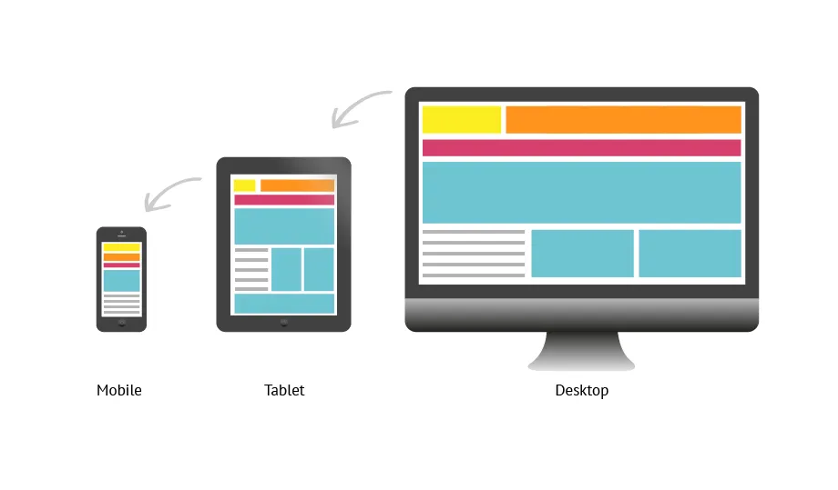
The increased usage of mobile devices and variations in the screen sizes has increased the need for responsive web design. Responsive web design means positive to any change with a quick reaction, while Adaptive means easily modified to a new situation. So, these terms are closely related to each other. Now it is highly essential to design a web site for a Freelance Web Designer NYC which is suitable for phones and multiple screens.
What are the main differences between Responsive and Adaptive Design
· Adaptive Design
The Web Designers use the layouts to multiple screen sizes because the layouts are dependent on the screen sizes to give a responsive look in multiple devices. The adaptive Design provides a positive user experience with more confidence in a functional user interface. The designers create a website or a theme with specific devices and screen sizes in mind. For instance, the designer has kept 13 inches screen in his mind, and shaped the design exclusively, and has to make more size designs. They have to create several versions of the fixed design, and each one of them made for a specific size without designing the layout.
When users browse the website on different devices like a desktop or laptop, the site chooses the best layout for the desktop screen. The resizing the browser does not affect the design.
· Adaptive Web Design is less Flexible
There are several different layouts for multiple screen sizes, in an Adaptive web Design. So, the final results don’t always display the best for a wide variety of screen sizes. The adaptive designs only work on as many screens as its layouts allow it. Usually, none of your adaptive layouts fit with well, when new screen size introduces in the market. The design will perform well on the sizes, that are enabled and you will have to edit them or add new layouts.
· Responsive Design
The layout is fluid and uses CSS to fit and change the styles, according to the devices and no matter what the screen size is it adopts and resizes the grids. It is extremely vital to understand the elements of responsive web design. The Web Designer in NYC never feels satisfied, only using the templates, they understand the importance of writing effective codes. Responsive websites have gained more importance than Adaptive web Design because it performs better on search engines. The responsive web design of the website brings more traffic and has more chances to enhance sales.
So, in the long run, the responsive design will benefit you a lot because it needs less maintenance as the new screen will emerge. As compared to Adaptive design, the responsive designs are a more reliable choice of Web Designers.
What constitutes a responsive design
· Fluid Grids and Images
In responsive design, the Grids constitute according to the relative proportion of various elements, instead of considering a fixed pixel ratio. These days the fixed pixel ratio does not value anymore, because it is no suitable for a verity of screens. Now, designers give an element a relative size or, percentage to fit it in the different size of the screen, ranging from inches to a few feet. They do not specify the height or width of elements and do not constitute the static amount of pixels they consider percentages.
The responsive design uses CSS to mark images with a maximum size rather than the least size. SS automatically maintains the aspect ratio to avoid pixelation.
· Mobile Site and Media Queries
Media Queries are the CSS related techniques that make the page functional according to the variety of sizes. It let you design various layouts for different media types like screen, print, TV, etc.
The Designers focus on to create a mobile site initially because they let the design grow organically. This technique enhances the futures that users like the most. It becomes more user-friendly on different screens as well.
Overall the Responsive and Adaptive both designs have their pitfalls and benefits. The Adaptive Design is more cost-effective and takes less time in testing, unlike the responsive design. In the end, the nature and requirements of the project define the needs, whether to implement an Adaptive or Responsive design.
